ISRAEL OYE


Mobile App Design
Mobile App Design
ui/ux design
ui/ux design
Eat Yum
Food delivery, Marketplace
Food delivery has become an essential part of modern living, but many users still struggle with fragmented restaurant options, complicated ordering flows, and lengthy checkout experiences.
EatYum was designed to bridge this gap by creating a centralized platform where users can browse a variety of restaurants, discover African meals, pastries, fast food, and local delicacies, then have them delivered directly to their doorstep.
The goal was to make ordering food as simple as deciding what to eat.
Figma

Tool
Eat Yum
Food Delivery, Marketplace
Food delivery has become an essential part of modern living, but many users still struggle with fragmented restaurant options, complicated ordering flows, and lengthy checkout experiences.
EatYum was designed to bridge this gap by creating a centralized platform where users can browse a variety of restaurants, discover African meals, pastries, fast food, and local delicacies, then have them delivered directly to their doorstep.
The goal was to make ordering food as simple as deciding what to eat.
Figma

Tool

TimeLine
January 2025 - April 2025
TimeLine
January 2025 - April 2025

Role
Product Designer
UI/UX
Role
Product Designer UI/UX
Users often encounter several challenges when ordering food online:
Limited Food Discovery
Many food apps focus heavily on popular fast-food chains while making local and African cuisines difficult to discover.
Complicated Onboarding
Users frequently abandon food delivery apps due to lengthy registration processes before they can explore available meals.
Information Overload
Restaurant listings often contain too much information, making it difficult for users to quickly compare options.
Slow Checkout Experiences
Multiple screens and excessive form fields create friction between meal discovery and purchase completion.
The Problem


The Problem
Users often encounter several challenges when ordering food online:
Limited Food Discovery
Many food apps focus heavily on popular fast-food chains while making local and African cuisines difficult to discover.
Complicated Onboarding
Users frequently abandon food delivery apps due to lengthy registration processes before they can explore available meals.
Information Overload
Restaurant listings often contain too much information, making it difficult for users to quickly compare options.
Slow Checkout Experiences
Multiple screens and excessive form fields create friction between meal discovery and purchase completion.

To understand user behavior, I analyzed:
• Existing food delivery applications
• Restaurant aggregator platforms
• Local food delivery experiences
• User reviews and feedback
Users primarily care about:
• Fast food discovery
• Clear restaurant information
• Easy onboarding
• Minimal checkout friction
• Trust in delivery process
• Variety of meal options
One recurring pattern emerged:
“Users want to spend less time navigating the app and more time choosing what they want to eat.”
Research & Insights
To understand user behavior, I analyzed:
• Existing food delivery applications
• Restaurant aggregator platforms
• Local food delivery experiences
• User reviews and feedback
Users primarily care about:
• Fast food discovery
• Clear restaurant information
• Easy onboarding
• Minimal checkout friction
• Trust in delivery process
• Variety of meal options
One recurring pattern emerged:
“Users want to spend less time navigating the app and more time choosing what they want to eat.”
Research & Insights
The project focused on four major goals:
Simplify Onboarding
Allow users to start using the platform quickly.
Improve Food Discovery
Make it easy to find both local and international meal options.
Reduce Ordering Friction
Minimize steps required to complete an order.
Build Trust
Create a clean, modern interface that feels reliable and secure.
Goal
The project focused on four major goals:
Simplify Onboarding
Allow users to start using the platform quickly.
Improve Food Discovery
Make it easy to find both local and international meal options.
Reduce Ordering Friction
Minimize steps required to complete an order.
Build Trust
Create a clean, modern interface that feels reliable and secure.
Goal
For streamlined onboarding, EatYum introduces a clean onboarding experience with:
• Phone number verification
• Minimal personal information
• Optional referral system
• Guest access option
This allows users to explore the platform quickly without feeling overwhelmed.
For restaurant discovery experience, the restaurant menus was designed around exploration with choice options including:
• African Dishes
• Pastries
• Local Delicacies
• Fast Food
• Beverages
For trust around verifiable restaurant listings, each listing provides:
• Restaurant name
• Rating
• Delivery estimate
• Quick visual preview
This enables faster decision making.
Strategy
For streamlined onboarding, EatYum introduces a clean onboarding experience with:
• Phone number verification
• Minimal personal information
• Optional referral system
• Guest access option
This allows users to explore the platform quickly without feeling overwhelmed.
For restaurant discovery experience, the restaurant menus was designed around exploration with choice options including:
• African Dishes
• Pastries
• Local Delicacies
• Fast Food
• Beverages
For trust around verifiable restaurant listings, each listing provides:
• Restaurant name
• Rating
• Delivery estimate
• Quick visual preview
This enables faster decision making.
Strategy
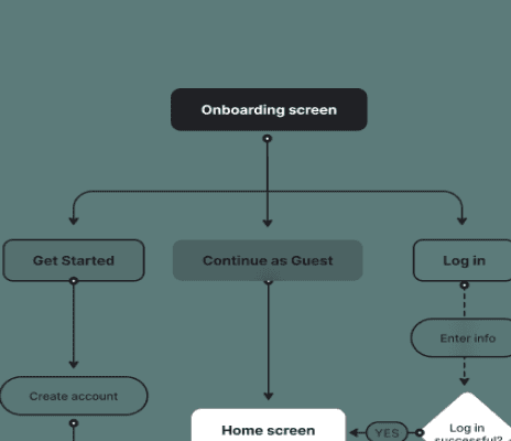
Core flow designed:
Onboarding → Discovers nearby restaurants → Browses meal options → Places order → complete payment → Tracks delivery
Each step solves the need for:
• Quick access to meals
• Access to multiple restaurants and meal categories
• Convenient affordable food options delivery
User Flow

Core flow designed:
Onboarding → Discovers nearby restaurants → Browses meal options → Places order → complete payment → Tracks delivery
Each step solves the need for:
• Quick access to meals
• Access to multiple restaurants and meal categories
• Convenient affordable food options delivery
User Flow
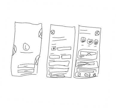
Early wireframes focused on:
• Structuring onboarding steps
• Gaining trust on first click
• Reducing decision making fatigue
The Low-Fi screens were designed to serve as a guide to the interface design process.
Wireframes


Early wireframes focused on:
• Structuring onboarding steps
• Gaining trust on first click
• Reducing decision making fatigue
The Low-Fi screens were designed to serve as a guide to the interface design process.
Wireframes
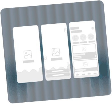
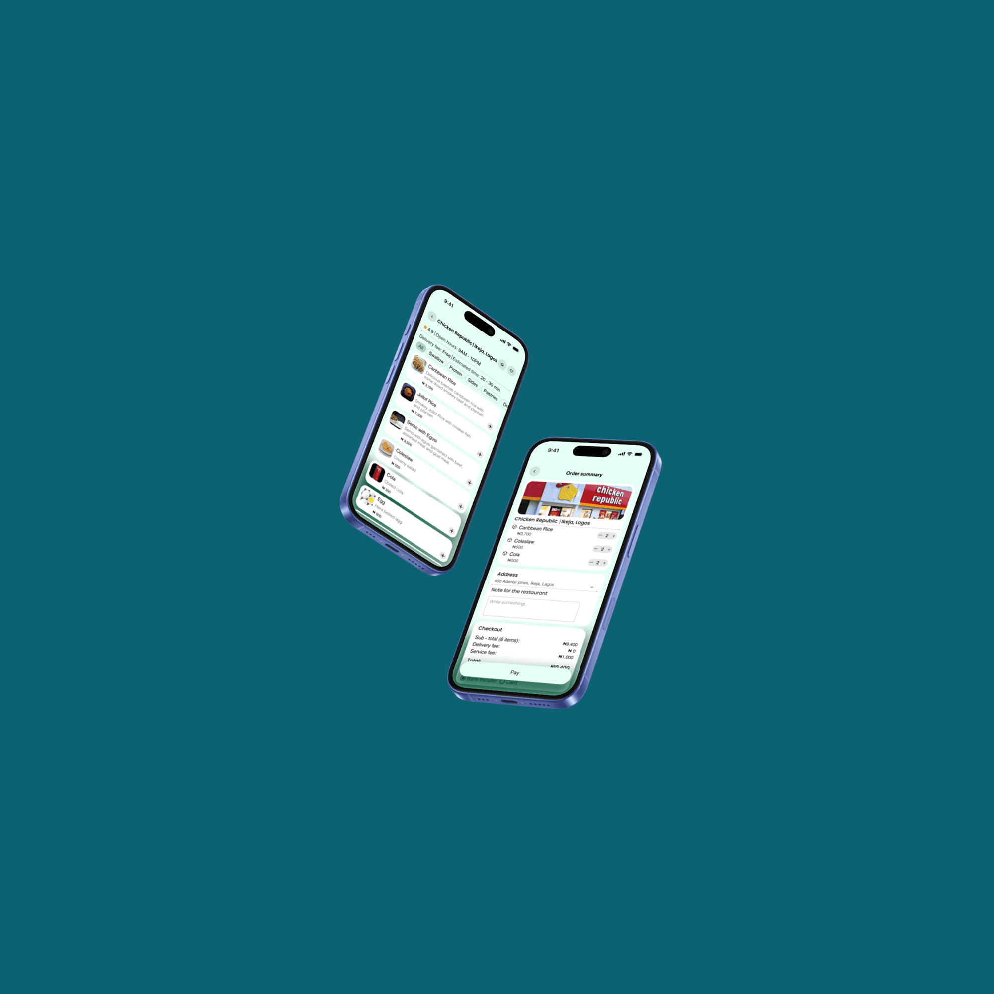
The final interface focused on:
• Simplified onboarding
• Smooth user experience
• Clean layout and interface
The high-Fi screens were designed with intention while following the low-Fi interfaces as guide to a user centered result.
Final Result
The final interface focused on:
• Simplified onboarding
• Smooth user experience
• Clean layout and interface
The high-Fi screens were designed with intention while following the low-Fi interfaces as guide to a user centered result.
Final Result

Color and Typography
Pale Mint Green
Primary Color
Hex: #E4FFF5
Dark Teal-Green
Secondary Color
Hex: #055738
White
Neutral Color
Hex: #FFFFFF
Light Red
Semantic Color
Hex: #FF6F47
Black
Neutral Color
Hex: #000000
Vibrant Green
Semantic Color
Hex: #09AA67
Helvetica
Aa
ABCDEFGHIJKLMNOPQRSTUVWXYZ
abcdefghijklmnopqrstuvwxyz
0123456789./?@#$%^&<>:;{}[]
Poppins
Aa
ABCDEFGHIJKLMNOPQRSTUVWXYZ
abcdefghijklmnopqrstuvwxyz
0123456789./?@#$%^&<>:;{}[]
Color and Typography
Pale Mint Green
Primary Color
Hex: #E4FFF5
Dark Teal-Green
Secondary Color
Hex: #055738
White
Neutral Color
Hex: #FFFFFF
Vibrant Green
Semantic Color
Hex: #09AA67
Black
Neutral Color
Hex: #000000
Light Red
Semantic Color
Hex: #FF6F47
Helvetica
Aa
ABCDEFGHIJKLMNOPQRSTUVWXYZ
abcdefghijklmnopqrstuvwxyz
Poppins
Aa
ABCDEFGHIJKLMNOPQRSTUVWXYZ
abcdefghijklmnopqrstuvwxyz
0123456789./?@#$%^&<>:;{}[]
Grid System
Mobile Grid
App user Interface design
Frame: 393x852
Column: 4
Type: Strech
Margin: 16
Gutter: 16

Grid system defining layout structure, alignment and spacing to ensure
valid consistency and responsive design across screens
Grid System
Mobile Grid
App user Interface design
Frame: 393x852
Column: 4
Type: Strech
Margin: 16
Gutter: 16
Grid system defining layout structure, alignment and spacing to ensure valid consistency and responsive
design across screens