ISRAEL OYE

Website & Mobile App Design
Website & Mobile App Design
ui/ux design,2d illustration, motion design
ui/ux design,2d illustration, motion design
Ezzy Exchange
Crypto & Gift card Platform
Designing a secure and intuitive platform that simplifies crypto transactions and digital asset exchange for everyday users. Crypto platforms often assume users already understand how things work.
In reality:
• New users feel overwhelmed during onboarding
• Transaction steps are unclear and risky
• Lack of clarity reduces trust and completion rates
This creates a gap between platform capability and user confidence.
Figma, Framer

Tools
Ezzy Exchange
Crypto & Gift card Platform
Designing a secure and intuitive platform that simplifies crypto transactions and digital asset exchange for everyday users. Crypto platforms often assume users already understand how things work.
In reality:
New users feel overwhelmed during onboarding
• Transaction steps are unclear and risky
• Lack of clarity reduces trust and completion rates
This creates a gap between platform capability and user confidence.
Figma, Framer

Tools


TimeLine
December 2025 - March 2026
TimeLine
December 2025 - March 2026

Role
Web & Product Designer
UI/UX
Role
Web & Product Designer UI/UX
Crypto platforms often assume users already understand how things work.
In reality:
• New users feel overwhelmed during onboarding
• Transaction steps are unclear and risky
• Lack of clarity reduces trust and completion rates
This creates a gap between platform capability and user confidence.
The Problem


Crypto platforms often assume users already understand how things work.
In reality:
• New users feel overwhelmed during onboarding
• Transaction steps are unclear and risky
• Lack of clarity reduces trust and completion rates
This creates a gap between platform capability and user confidence.
The Problem


After reviewing existing platforms a few patterns stood out:
• Too many steps during onboarding → drop-off
• Technical language → confusion for new users
• Poor feedback during transactions → anxiety
Key Insight:
Users don’t just need functionality, they need clarity and reassurance at every step
Research & Insights
After reviewing existing platforms a few patterns stood out:
• Too many steps during onboarding → drop-off
• Technical language → confusion for new users
• Poor feedback during transactions → anxiety
Key Insight:
Users don’t just need functionality — they need clarity and reassurance at every step
Research & Insights
Design a product experience that:
• Simplifies onboarding and first-time use
• Makes transactions feel clear and safe
• Reduces friction without compromising security
• Builds trust through better UX decisions
Goal
Design a product experience that:
• Simplifies onboarding and first-time use
• Makes transactions feel clear and safe
• Reduces friction without compromising security
• Builds trust through better UX decisions
Goal
Instead of adding more features, the focus was on:
• Reducing cognitive load
• Making each step intentional and understandable
• Designing flows that feel guided, not complex
Key decisions:
• Simplified onboarding flow
• Safe buy/sell transaction UX
• Clean, structured transaction UI
Strategy
Instead of adding more features, the focus was on:
• Reducing cognitive load
• Making each step intentional and understandable
• Designing flows that feel guided, not complex
Key decisions:
• Simplified onboarding flow
• Safe buy/sell transaction UX
• Clean, structured transaction UI
Strategy
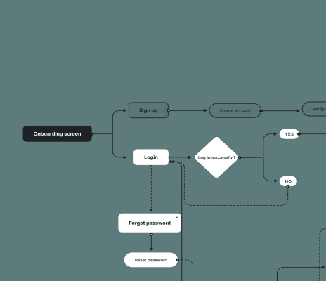
Core flow designed:
Sign up → Verify → Access dashboard → Initiate transaction → Confirm → Complete
Each step was optimized to:
• Reduce confusion
• Provide feedback
• Guide the user forward
User Flow

Core flow designed:
Sign up → Verify → Access dashboard → Initiate transaction → Confirm → Complete
Each step was optimized to:
• Reduce confusion
• Provide feedback
• Guide the user forward
User Flow
Early wireframes focused on:
• Structuring onboarding steps
• Prioritising essential actions
• Reducing unnecessary screens
Designing the Low-Fi screens helped eliminate complexity before moving into high-Fi interface.
Wireframes


Early wireframes focused on:
• Structuring onboarding steps
• Prioritising essential actions
• Reducing unnecessary screens
Designing the Low-Fi screens helped eliminate complexity before moving into high-Fi interface.
Wireframes


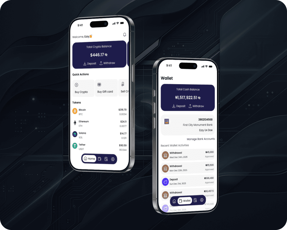
The final interface focused on:
• Clean layout with strong hierarchy
• Minimal distractions
• Clear action points
Designing the Low-Fi screens helped eliminate complexity before moving into high-Fi interface.
Final Result

The final interface focused on:
• Clean layout with strong hierarchy
• Minimal distractions
• Clear action points
Designing the Low-Fi screens helped eliminate complexity before moving into high-Fi interface.
Final Result

Color and Typography
Dark Blue
Primary Color
Hex: #1E1C4B
White Smoke
Secondary Color
Hex: #F5F5F5
White
Neutral Color
Hex: #FFFFFF
Lime Green
Semantic Color
Hex: #26A17B
Black
Neutral Color
Hex: #000000
Red
Semantic Color
Hex: #FF291A
Open Sans
Aa
ABCDEFGHIJKLMNOPQRSTUVWXYZ
abcdefghijklmnopqrstuvwxyz
Poppins
Aa
ABCDEFGHIJKLMNOPQRSTUVWXYZ
abcdefghijklmnopqrstuvwxyz
0123456789./?@#$%^&<>:;{}[]
Color and Typography
Dark Blue
Primary Color
Hex: #1E1C4B
White Smoke
Secondary Color
Hex: #F5F5F5
White
Neutral Color
Hex: #FFFFFF
Lime Green
Semantic Color
Hex: #26A17B
Black
Neutral Color
Hex: #000000
Red
Semantic Color
Hex: #FF291A
Open Sans
Aa
ABCDEFGHIJKLMNOPQRSTUVWXYZ
abcdefghijklmnopqrstuvwxyz
Poppins
Aa
ABCDEFGHIJKLMNOPQRSTUVWXYZ
abcdefghijklmnopqrstuvwxyz
0123456789./?@#$%^&<>:;{}[]
Grid System
Mobile Grid
App user Interface design
Frame: 393x852
Column: 4
Type: Strech
Margin: 16
Gutter: 16

Desktop Grid
Website design
Frame: 1280x832
Column: 12
Type: Strech
Margin: 120
Gutter: 16
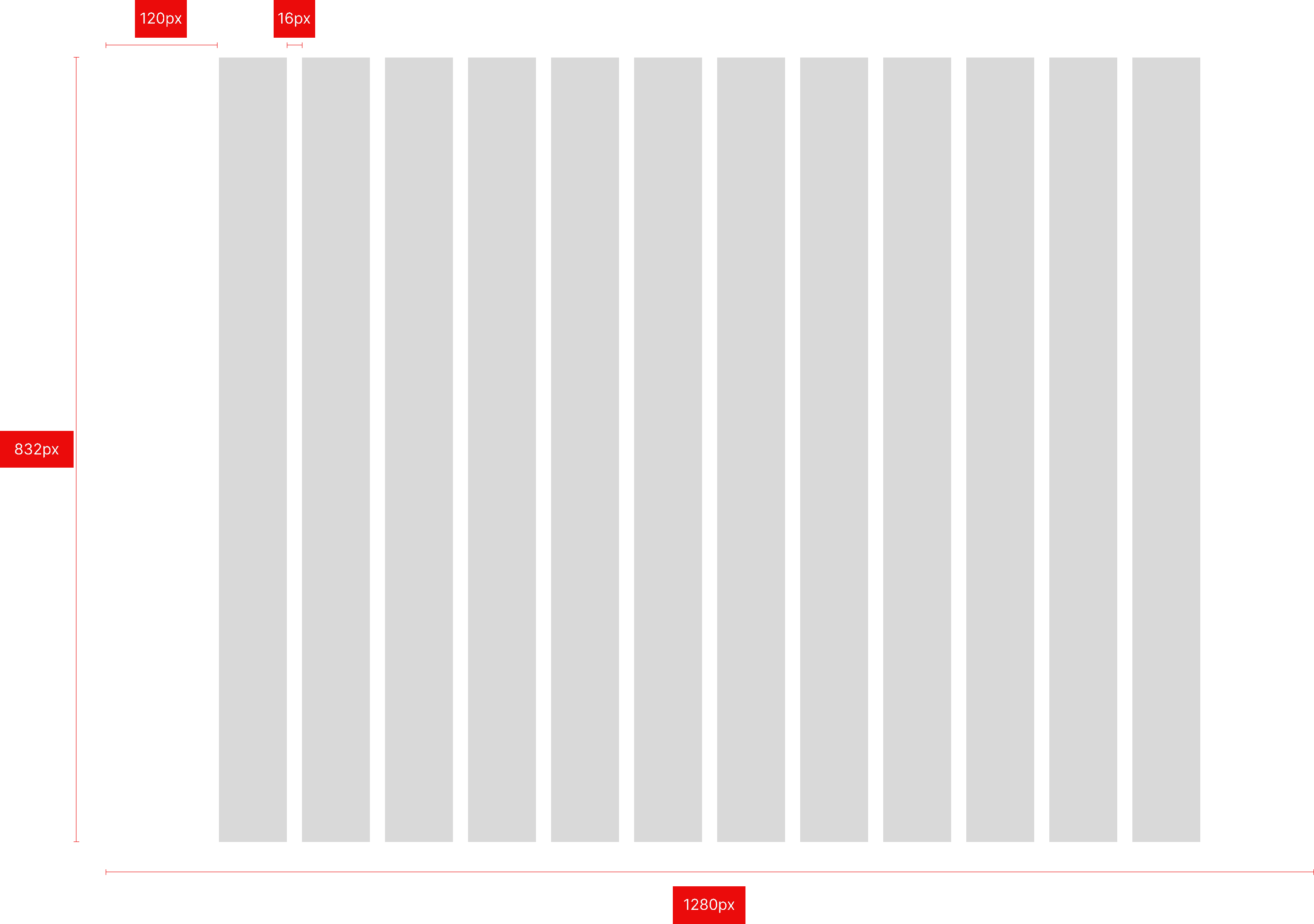
Grid systems defining layout structure, alignment and spacing to ensure
valid consistency and responsive design across screens
Grid System
Mobile Grid
App user Interface design
Frame: 393x852
Column: 4
Type: Strech
Margin: 16
Gutter: 16
Grid systems defining layout structure, alignment and spacing to ensure valid consistency and responsive
design across screens
Desktop Grid
Website design
Frame: 1280x832
Column: 12
Type: Strech
Margin: 120
Gutter: 16