ISRAEL OYE


Mobile App Design
Mobile App Design
ui/ux design
ui/ux design
ThePACIFIC Furniture
E-commerce Shopping Platform
Designing a clearer furniture browsing experience through better visualisation, product discovery, and mobile UX. Users find buying furniture online difficult as the purchasing experience are not physically felt.
Users struggle with understanding product visualisation which creates uncertainty, hesitation and lower buying confidence.
Figma

Tool
ThePACIFIC Furniture
E-commerce Shopping Platform
Designing a clearer furniture browsing experience through better visualisation, product discovery, and mobile UX. Users find buying furniture online difficult as the purchasing experience are not physically felt.
Users struggle with understanding product visualisation which creates uncertainty, hesitation and lower buying confidence.
Figma

Tool

TimeLine
August 2024 - October 2024
TimeLine
August 2024 - October 2024

Role
Product Designer
UI/UX
Role
Product Designer UI/UX
Buying furniture online is difficult because users cannot physically experience the product before purchasing.
During product analysis, the obvious major UX problems were:
1. Visualisation Problem
Users struggled to understand:
• actual furniture size
• spacing
• texture
• fit within their room
• colour accuracy
The interface relied heavily on static product images, making products feel disconnected from real-life environments.
This created uncertainty, hesitation, lower buying confidence
2. Weak Product Discovery
The browsing experience made it difficult for users to:
• quickly find relevant furniture
• compare products efficiently
• filter based on room type
• continue exploring naturally
Users experienced cognitive overload, long browsing sessions, decision fatigue.
3. Poor Mobile Shopping Experience
The mobile experience felt compressed and visually noisy.
Issues included:
• inconsistent spacing
• cluttered layouts
• difficult navigation
• excessive taps before reaching key information
• overwhelming product pages
Since most users browsed from mobile devices, usability became a major business concern.
The Problem

The Problem
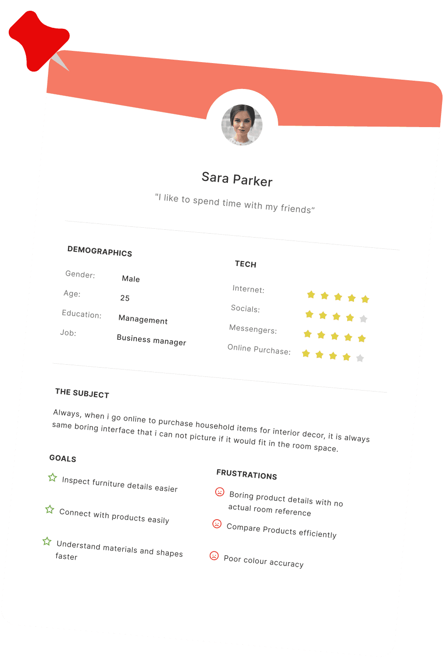
Buying furniture online is difficult because users cannot physically experience the product before purchasing.
During product analysis, the obvious major UX problems were:
1. Visualisation Problem
Users struggled to understand:
• actual furniture size
• spacing
• texture
• fit within their room
• colour accuracy
The interface relied heavily on static product images, making products feel disconnected from real-life environments.
This created uncertainty, hesitation, lower buying confidence

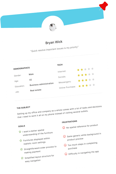
2. Weak Product Discovery
The browsing experience made it difficult for users to:
• quickly find relevant furniture
• compare products efficiently
• filter based on lifestyle or room type
• continue exploring naturally
Users experienced cognitive overload, long browsing sessions, decision fatigue.
3. Poor Mobile Shopping Experience
The mobile experience felt compressed and visually noisy.
Issues included:
• inconsistent spacing
• cluttered layouts
• difficult navigation
• excessive taps before reaching key information
• overwhelming product pages
Since most users browsed from mobile devices, usability became a major business concern.
To better understand the experience, I analyzed:
• leading furniture platforms
• modern e-commerce interaction patterns
• mobile shopping behavior
• user browsing psychology
I also studied how users typically purchase furniture:
• inspiration first
• comparison second
• decision-making last
This showed that furniture shopping is highly emotional and visual not purely transactional.
Users needed:
• clarity
• confidence
• environmental context
• easier exploration
Research & Insights
To better understand the experience, I analyzed:
• leading furniture platforms
• modern e-commerce interaction patterns
• mobile shopping behavior
• user browsing psychology
I also studied how users typically purchase furniture:
• inspiration first
• comparison second
• decision-making last
This showed that furniture shopping is highly emotional and visual not purely transactional.
Users needed:
• clarity
• confidence
• environmental context
• easier exploration
Research & Insights
Design a product focused on three clear goals:
• Improve Product Visualisation
Help users better imagine products in real spaces.
• Simplify Discovery
Reduce friction while browsing and filtering products.
• Optimize Mobile UX
Create a clean, intuitive, touch-friendly mobile experience.
Goal
Design a product focused on three clear goals:
• Improve Product Visualisation
Help users better imagine products in real spaces.
• Simplify Discovery
Reduce friction while browsing and filtering products.
• Optimize Mobile UX
Create a clean, intuitive, touch-friendly mobile experience.
Goal
The product experience was redesigned around:
• visual hierarchy
• reduced cognitive load
• progressive disclosure
• clean interaction patterns
• mobile-first usability
The goal was to make furniture browsing feel:
• calm
• intentional
• premium
• effortless
Strategy
The product experience was redesigned around:
• visual hierarchy
• reduced cognitive load
• progressive disclosure
• clean interaction patterns
• mobile-first usability
The goal was to make furniture browsing feel:
• calm
• intentional
• premium
• effortless
Strategy
Core flow designed:
Sign up → Verify → Access Homepage → Browse products → Place order → Complete order
Each step was optimised to:
• Improve product visualisation
• Reduce friction in browsing product
• Simplified order process
User Flow

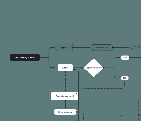
Core flow designed:
Sign up → Verify → Access Homepage → Browse products → Place order → Complete order
Each step was optimised to:
• Improve product visualisation
• Reduce friction in browsing product
• Simplified order process
User Flow
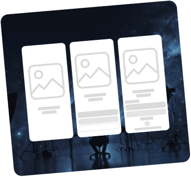
Early wireframes focused on:
• Structuring onboarding steps
• Prioritising essential actions
• Reducing unnecessary screens
Designing the Low-Fi screens helped eliminate complexity before moving into high-Fi interface.
Wireframes


Early wireframes focused on:
• Structuring onboarding steps
• Prioritising essential actions
• Reducing unnecessary screens
Designing the Low-Fi screens helped eliminate complexity before moving into high-Fi interface.
Wireframes

The final interface focused on:
• Easier browsing experience
• Better product clarity
• More intentional visual hierarchy
Designing the Low-Fi screens helped helped map out layout structure before designing the high-Fi screens.
Final Result
The final interface focused on:
• Easier browsing experience
• Better product clarity
• More intentional visual hierarchy
Designing the Low-Fi screens helped helped map out layout structure before designing the high-Fi screens.
Final Result


Color and Typography
Dark Vanilla
Primary Color
Hex: #CFB79D
Umber
Secondary Color
Hex: #352315
White
Neutral Color
Hex: #FFFFFF
Vibrant Green
Semantic Color
Hex: #16BF13
Matte Black
Neutral Color
Hex: #171717
Alloy orange
Semantic Color
Hex: #BF7513
Instrument Serif
Aa
ABCDEFGHIJKLMNOPQRSTUVWXYZ
abcdefghijklmnopqrstuvwxyz
Manrope
Aa
ABCDEFGHIJKLMNOPQRSTUVWXYZ
abcdefghijklmnopqrstuvwxyz
0123456789./?@#$%^&<>:;{}[]
Color and Typography
Dark Vanilla
Primary Color
Hex: #CFB79D
Umber
Secondary Color
Hex: #352315
White
Neutral Color
Hex: #FFFFFF
Vibrant Green
Semantic Color
Hex: #16BF13
Matte Black
Neutral Color
Hex: #171717
Alloy orange
Semantic Color
Hex: #BF7513
Instrument Serif
Aa
ABCDEFGHIJKLMNOPQRSTUVWXYZ
abcdefghijklmnopqrstuvwxyz
Manrope
Aa
ABCDEFGHIJKLMNOPQRSTUVWXYZ
abcdefghijklmnopqrstuvwxyz
0123456789./?@#$%^&<>:;{}[]
Grid System
Mobile Grid
App user Interface design
Frame: 393x852
Column: 4
Type: Strech
Margin: 16
Gutter: 16

Grid system defining layout structure, alignment and spacing to ensure
valid consistency and responsive design across screens
Grid System
Mobile Grid
App user Interface design
Frame: 393x852
Column: 4
Type: Strech
Margin: 16
Gutter: 16
Grid system defining layout structure, alignment and spacing to ensure valid consistency and responsive
design across screens